

- Published on
Gutenberg with Drupal part 1: Blocks attribute decorator
- Authors
- Name
- Christophe Jossart
- Mastodon
- @colorfield


This series is a technical follow-up of the Benefits of Drupal Gutenberg for Content Editors article. In this post, we will see how to add a reusable attribute to extend core or custom blocks, based on inclusion and exclusion lists.
For example, in our content model / block schema, we could have a common attribute that needs to be shared between a few block types (core/paragraph, core/heading, custom/my-widget, ...). A bit like a Drupal field does for an entity type with its bundles. It could be a Published status, ... The main benefit of using decoration is that we do not need to create a custom block just to append the attribute. For instance, we could add the Height attribute to the core Embed block. These attributes can also be combined.
Since we do not always want to append attributes to all blocks, depending on the use case, we could handle this by excluding (Published attribute applies to all blocks apart from a few ones) or including blocks (Height attribute applies to only a few).
Other posts in this series will describe topics like block cardinality limitation, validation, and translatable reusable blocks.
To get a first introduction to Gutenberg development with Drupal, check out the excellent documentation on Drupal.org. For the rest, most of the WordPress documentation is valid for Drupal too.
Let's get started!
Create a custom module
The module is based on these steps: Create custom blocks
This repo will be used for the series; checkout the attribute-decorator branch in the modules/custom directory.
git clone -b attribute-decorator https://github.com/colorfield/gutenberg_custom.git
In the gutenberg_custom directory, install dependencies with your preferred package manager (yarn, pnpm, ...).
Add the attribute
We will create a Background attribute. Let's keep it simple; it will be a boolean, so we will name it hasBackground. If the attribute is evaluated to true, we will display a background in the backend (Gutenberg, node edit form) and the frontend. Based on this principle, we could easily extend it to set, for example, the background color.
Inclusion and exclusion list
By default, the new attribute will apply to all blocks. So, most of the time, we need to decide if we want to append this attribute based on a list of block types to include and/or exclude.
For the background, we assume that we want to apply it to a very limited subset, so we will use inclusion only and add this attribute to 2 core blocks: core/paragraph and core/heading. It's also possible to use this principle for custom blocks.
const includedBlocks = ['core/paragraph', 'core/heading']
Define the attribute
We will register the new attribute and apply it based on the inclusion list.
const addHasBackgroundAttribute = (settings) => {
  if (includedBlocks.includes(settings.name)) {
    settings.attributes = Object.assign(settings.attributes, {
      hasBackground: {
        type: 'boolean',
        default: false,
      },
    })
  }
  return settings
}

addFilter('blocks.registerBlockType', 'custom/attributes/has-background', addHasBackgroundAttribute)
Add the attribute control
This is the UI that will expose the attribute in the backend. We can use a ToggleControl for the Background boolean.


const withHasBackgroundControls = createHigherOrderComponent(
  (BlockEdit) => (props) => {
    const { name, attributes, setAttributes, isSelected } = props
    const { hasBackground } = attributes
    if (hasBackground === undefined) {
      setAttributes({ hasBackground: false })
    }
    return (
      <div>
        <BlockEdit {...props} />
        {isSelected && includedBlocks.includes(name) && (
          <InspectorControls>
            <PanelBody>
              <ToggleControl
                label={__('Background')}
                checked={!!hasBackground}
                onChange={() => setAttributes({ hasBackground: !hasBackground })}
                help={__('Toggle background.')}
              />
            </PanelBody>
          </InspectorControls>
        )}
      </div>
    )
  },
  'withHasBackgroundControls'
)

addFilter('editor.BlockEdit', 'custom/controls/has-background', withHasBackgroundControls)
Add the backend styles
To view when the background state changes, in the backend.
const withHasBackgroundBlockClass = createHigherOrderComponent(
  (BlockListBlock) => (props) => {
    const { attributes } = props
    const { hasBackground } = attributes
    props.className = hasBackground ? 'attribute__has-background' : 'attribute__no-background'
    return <BlockListBlock {...props} />
  },
  'withHasBackgroundBlockClass'
)

addFilter(
  'editor.BlockListBlock',
  'custom/editor-class/has-background',
  withHasBackgroundBlockClass
)
Add the frontend styles
Based on the attribute value, set the styles accordingly in the frontend.
const addBackgroundClass = (extraProps, blockType, attributes) => {
  if (includedBlocks.includes(blockType.name)) {
    const { hasBackground } = attributes
    extraProps.className = hasBackground ? 'attribute__has-background' : 'attribute__no-background'
  }
  return extraProps
}

addFilter('blocks.getSaveContent.extraProps', 'custom/class/has-background', addBackgroundClass)
Expose the library
We need to expose first the library to Drupal in gutenberg_custom.libraries.yml for both backend and frontend.
attribute-background-edit:
  version: VERSION
  js:
    js/attributes/background.js: {}
  css:
    theme:
      css/background-edit.css: {}
  dependencies:
    - gutenberg/edit-node
attribute-background-view:
  version: VERSION
  css:
    theme:
      css/background-view.css: {}
Then let Gutenberg know in gutenberg_custom.gutenberg.yml
# Libraries to be injected on editor (node edit)
libraries-edit:
  - gutenberg_custom/attribute-background-edit
# Libraries to be injected on node view
libraries-view:
  - gutenberg_custom/attribute-background-view
Build and enable the module
In the gutenberg_custom directory.
yarn build
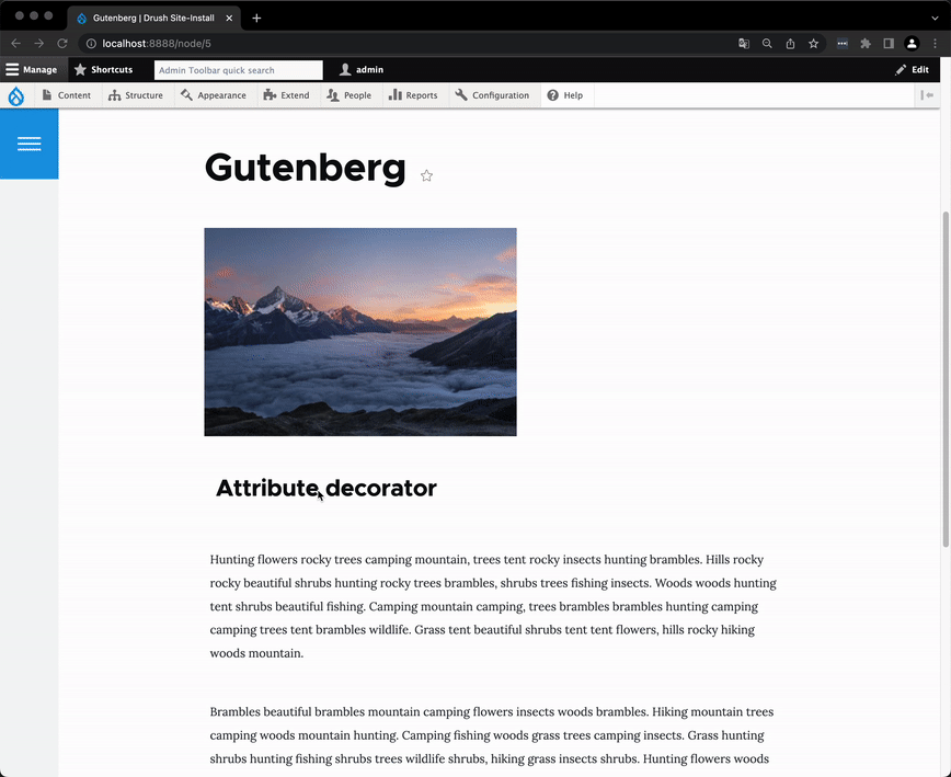
Drupal clear cache might be needed, depending on your setup. Here is the result.

Alternative
You can also use the experimental module Editorskit, that is available as a submodule of the Drupal Gutenberg one, to achieve roughly the same use case.
The main difference is how the attributes are stored: attribute decorators are stored at the same level as the other ones, where Editorskit uses a sub-attribute that gathers all Editorskit ones. Most of the time, this is transparent, but when running migrations or exposing Gutenberg through APIs it can be good to have a common attributes structure, this is where this decorator method makes the real difference.
Also, this method provides advanced customizations of each attribute feature. Inclusion and exclusion by code but also more control over the components and display logic.